REQUESTED POSTS
Following numerous requests I have added three examples of my thought process in developing visual styles. They can all be accessed on this page by clicking on the appropriate tab. I have attached numerous video clips to illustrate my points. I am currently in the process of writing and building a page with the development of The Spitfire Grill, which has been the most requested.
Feel free to send any questions or comments by clicking on the contact link above.
Examples of Development of Visual Style
Shooting The Three Stooges on Super 16mm Film.
- “current day” interiors and exteriors Eastman Kodak EXR 7248 100T
- “flashbacks” interiors and exteriors Eastman Kodak EXR 7298 500T
- “shorts” Eastman Kodak EXR 7245 50D
Interview: Filming Halloween 5′s Laundry Chute Sequence With DP Rob Draper, ACS
By Christian Sellers
Halloween 5: The Revenge of Michael Myers has long since divided fans of the series, with some feeling that the movie failed to live up to the comeback of The Return of Michael Myers and others appreciating the European feel that Swiss filmmaker Dominique Othenin-Girard brought to the picture. Arguably the movie’s stand-out moment is the sequence in which the young heroine (played by eleven-year old Danielle Harris) is trapped inside a laundry chute, as Michael repeatedly stabs his knife through the side. The scene would be the result of hard work and extensive preparation between Othenin-Girard and his director of photography, Robert Draper ACS, who would later shoot the cult horror flicks Tales from the Darkside: The Movie and Dr. Giggles. Robert Draper talks Retro Slashers through the shooting of Halloween 5‘s laundry chute sequence.QUESTION: How was the scene described in the script and what were your initial thoughts on how you would approach filming?
“I should start by saying that laundry chute sequence is one of my favorite scenes I’ve ever shot in my thirty years as a cinematographer. It was a challenge, both from a physical shooting point of view, from a lighting point of view and from a conceptual point of view. I remember reading the screenplay the first time and wondering, “How the hell are we going to shoot that?” It was a great challenge and resulted in a fantastic collaborative effort between myself, Dominique and Brent Swift, the production designer.For Dominique and I, the single most important aspect of shooting this scene was to get the audience inside that chute with danielle. We figured if the audience could feel claustrophobic and dusty and the sense of panic then we would be 90% of the way home in achieving the intent of the scene. This of course required that we use wide lenses in close and in the chute that would not necessarily help with the claustrophobic feel… so we spent a lot of time working on how to get the audience into the chute to suffer along with Danielle.The challenge with laundry chute was an obvious one, of course. We had an 18-inch square chute that went from the first floor into the basement of the building. Not only was it long chute with a very confined space but it was night with all the lights off in the house. So the compelling question was how do I light this and make it look believable when in reality it should be pitch black? So the twofold physical challenge was how do we actually lens the sequence and also, from the lighting viewpoint, how do I make it look believable? Of course one other factor… how do we get the camera into a laundry chute, or at least scale it to look believable? The genius behind that particular challenge was really the production designer, Brent Swift.
QUESTION: How organized was Dominique Othenin-Girard as a director and did he know exactly what he wanted and how it could be achieved with regards to this scene?
“Dominique was extremely well prepped for this entire film and he knew, shot-by-shot, how this film was going to go together right from the very start. This made shooting the entire film a real pleasure because Dominique had a very clear picture of what he wanted to see up on the screen and he had a very clear idea of what lenses he would like to use for each of the scenes.On one hand, that made shooting a pleasure on the other hand it made shooting very difficult because Dominique wanted to use a lot of wide-angle lenses, very, very low, so quite often we would have the camera positioned in the corner of a room, on the floor, on an 18mm lens, which made lighting extremely difficult. In a dark film, you don’t want light coming from the direction of the camera as it destroys all the mood. Having the camera low and wide, seeing the whole room, made it impossible to light from behind the actors; essentially I had nowhere to hide the lights, so everything had to come from either outside (through windows, other rooms, etc.) or from behind the camera in such a way as to make it appear the light was coming from behind or to the side of the actors. It became quite a challenge to get the lighting to look believable and moody and atmospheric and get the drama cross. But it was one of those challenges that constantly pushes you to be inventive.
QUESTION: What is your usual method when reading a script and bringing it out from the page and onto the screen? Do you have a specific routine on how you break down each sequence?
“To be really honest I don’t really have a routine that I go through. I read the script and generally images will start to pop into my head and, after several readings, and a lot of notes and scribbles all over the script, I start to slowly put together an overall, broad brush version of how I see the film. I’ll read the script many many times. It is important for the DP (as well as the actors and director) to have the full story completely told well before shooting.Given that no movie is shot in sequence, you need to have every scene clearly structured so when everything is assembled it makes sense from a lighting, movement and lensing perspective. I will have a lot of discussions with the director to get a clear picture of how he/she wants the story told and the same with the production designer. Armed with my thoughts and the director’s wishes, I will then start piecing the film together scene-by-scene, focusing on lighting continuity, lens choice, camera movement, color… all the elements.I also like to have a chat to the editor before we start shooting to get an idea of how they see the film going together and quite often they will have some requests that will help them piece the film together better in the cutting room. Overall, it’s a step-by-step process, but by the time shooting commences I can very clearly visualize the entire movie, scene-by-scene, in my mind… even to the extent of “pre-visualizing” it much the same way a downhill skier previsualizes the course before going onto the course.”
QUESTION: How detailed were the storyboards that you designed prior to filming and how long did these take to create?
“As I mentioned earlier, the real genius behind the physical staging of this scene was Brent Swift, the production designer. Dominique had a very clear idea of how he wanted to visualize the story and he and I talked through all the challenges we were facing. We had a storyboard artist draw a set of boards for the scene outlining all the shots and lens choices for each shot. Brent then took the storyboards, went off and designed all the set pieces needed to achieve the shots outlined in the boards. What he came up with was absolutely brilliant. I cannot remember how many panels were in the sequence but there were a lot. In the end there was somewhere in the range of thirty-five to forty different set pieces that made up the laundry chute sequence.It took Brent quite a while to conceptualize everything and this was going on whilst we were already shooting. The day we shot the scene we arrived to set with all the individual set pieces laid out around the studio floor and each piece had a number. Then we had a large board with all the storyboard panels laid out in shooting order and each panel had a number corresponding to the matching set piece for that shot. Basically, what we had was a very detailed shopping list of all the elements needed to tell the story. We essentially just moved across the panels and as each one was shot we put a big red cross through them all until we were done. Of course, the editor had been involved on this one as well so we had editorial input to be sure all these elements would fit together seamlessly.”
QUESTION: There were several different versions of the chute that were built in order to complete this scene, including sections that were removable so the camera could film through and another where the camera was moved along on a skateboard. Can you talk us through each one and how they came together to make a whole sequence?
“Well there were too many set pieces to talk through all of them, but basically the way this worked was we had pieces of chute that were vertical with the sides cut out. We had pieces lying on their side, allowing us to “dolly” the camera inside the chute. We did that on a skateboard with a pole attached so we could roll it along in front of Danielle; use it to push in or as a moving POV. We had pieces with small windows cut in it so we could put Danielle inside a narrow chute and get her reactions. We had a single walled set piece which duplicated the wall with the chute door so that could be shot on the stage. There were places where we could remove panels, there was everything you can imagine, as I said the thirty-five to forty set pieces.One of the shots that really sells the laundry chute sequence is the shot in the basement when Danielle falls down the chute and hits the bottom. I love that shot.
QUESTION: Did Danielle Harris perform during the entire scene or was there a stunt double for the more difficult moments?
“To be honest I cannot recall but I am pretty sure Danielle did everything in the laundry chute sequence, largely because it was all on set and very controlled. We did have a stunt double for Danielle on the movie but I don’t recall the double did any of the shots in the laundry chute sequence.I remember when we shot the scene in the laundry room in the basement, running Danielle ragged as we had to do quite a few takes to piece that together”QUESTION: Don Shanks was using a real knife to cut through the side of the chute; was Danielle ever inside at the time or were these shots filmed separately?
“No, Danielle was never inside the chute when Don was actually doing the stabbing shots and, in fact, we did do shots where you can see Danielle’s legs inside the chute when Don was stabbing, but they were with prosthetic legs. We obviously couldn’t have a real actress in there with a real knife going through it.”Placing Horizon Lines in The Adventures of Roman - An Outback Musical
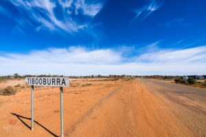
"Roman" featured an original score by renowned Jazz Musician/Trumpet Player James Morrison with Christopher Horsey ("Bootmen") as "Roman" starring and choreographer, The Topp Twins as "the Fates" , David Ngoombujarra ("Down & Under") as "Albert", Michael Veitch ("Fast Forward") as the "Guardian of the Threshold, Taryn Laleen as "Spirit Guide", John Morrison as "The Butcher" www.swingcity.com.au
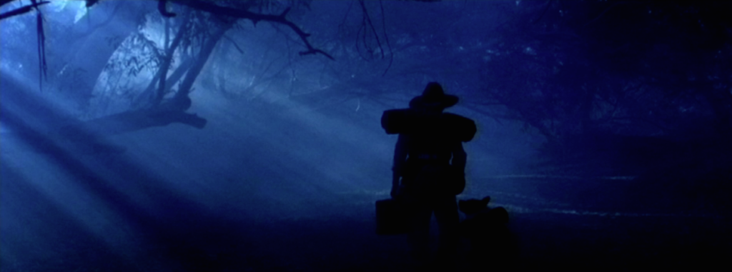
As a side note, shooting at the intersection of Sth Australia, NSW, Qld and Northern Territory and working on a limited budget, we needed to shoot as much as possible available light with only reflectors, bounces and careful attention to sun position. All the dreamtime dance sequences were shot totally available daylight with each angle timed to the position of the sun.
After discussions with Anny we decided to shoot flat 2.35:1 aspect ratio on spherical lenses to make the most of the outback locations and the wide theatrical screen. The aspect ratio also worked well for the staging of many of the scenes which required vast wide shots as well as substantial separation between the actors.
Eric grabbed some cardboard, cut out a 2.35:1 frame, drew a this line across a table and we started playing. We were both surprised to discover that the more off horizontal the horizon became, the more interesting the picture. However, that was great for static shots or one angle but how about intercutting?
In fact it did, and it worked brilliantly (if I do say so myself). Strangely, when watching the film the angle of the horizon and the actors was not noticeable to audiences, unless they were told about it up front. If it was mentioned after a screening they could not recall.
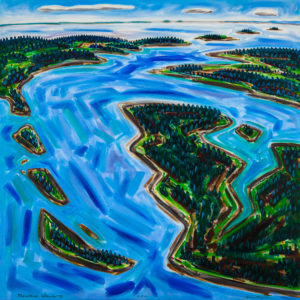
Visit Eric Hopkins Gallery
Want to know about the Aboriginal Songlines?
Video presented by Colin Jones, lecturer in Aboriginal History, talking about his culture, his history and his art.
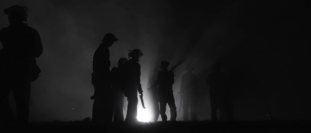
The lighting plan was simple, there were essentially no lights.
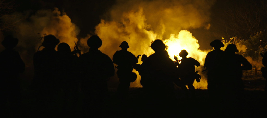
The concept called for very minimal lighting as Director, David Bradbury, wanted absolute realism and the nights of the battle, as described by the Vets who were there, "were pitch black, no moon, nothing, just black". Helping keep to this plan was the fact this was being done on a vey tight budget so there was no financial room for condors with 12K's, balloons, Musco, generators, etc. to light the huge battle field for the all night time battle scenes.
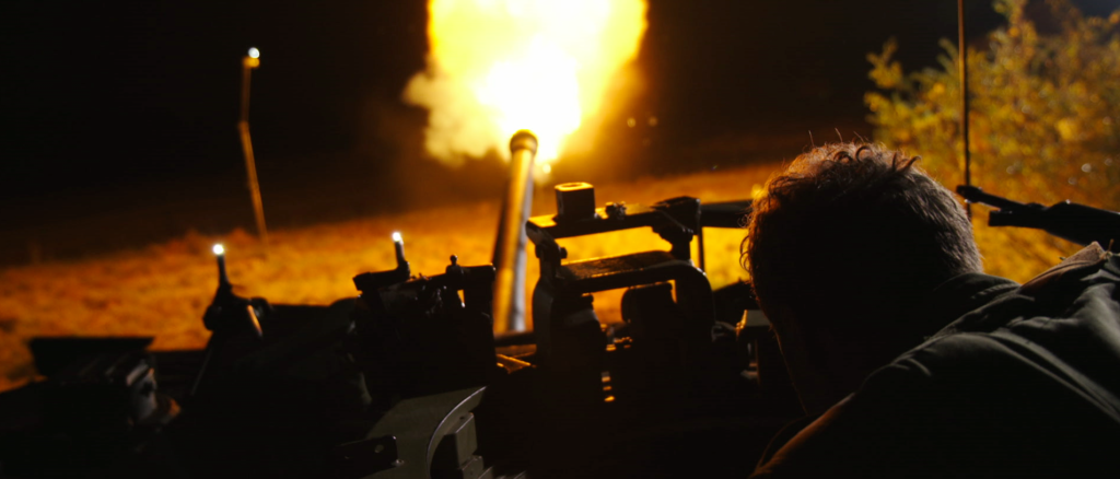
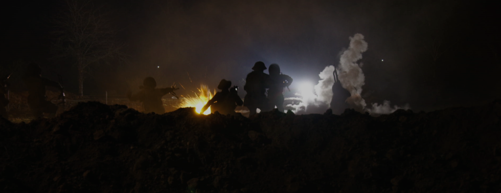
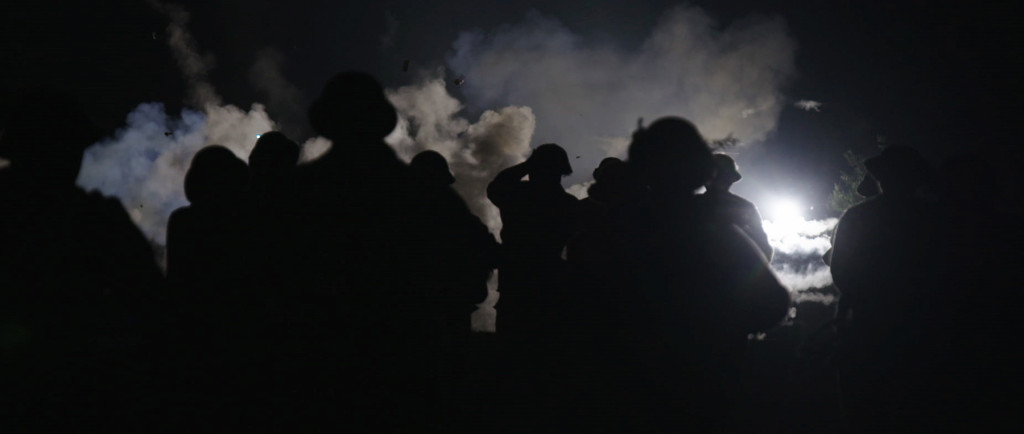
The lighting plan involved playing the battle in "layers", lighting, at very low intensity, the background and then allowing flares, explosions and muzzle flash to light the middle ground and foreground with no additional supplemental foreground lighting.
Essentially everything played in silhouette unless "soldiers" were captured on camera during an explosion or muzzle flash.
Each sequence was staged by laying down smoke from explosive pots in the deep background. This was lit by the explosions themselves and by a single 5K backlighting the smoke at extremely low level. Next the explosions moved progressively towards camera laying more smoke and the middle ground and foreground was the charging troops and lots of muzzle flash. Essentially everything played in silhouette unless "soldiers" were captured on camera during an explosion or muzzle flash. The added benefit of this was no-one (particularly the camera operators) had any idea where anyone was except when there was light.....again, exactly as experienced by those who were there, and this, adding to the realism.
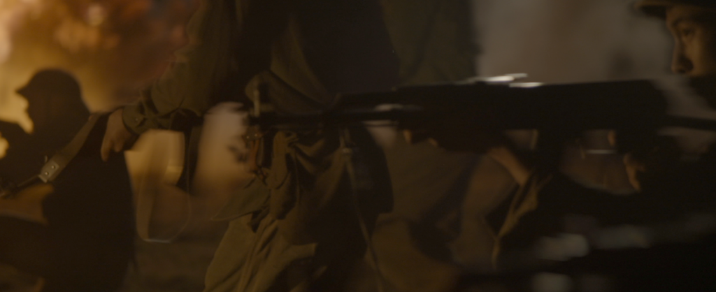
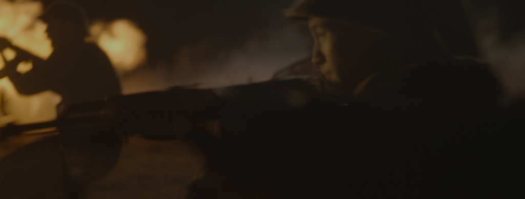
Ultimately the effect was to create as much disorientation and chaos as possible so nothing was evenly lit and only fleeting glimpses of the action were visible. Exactly as it was described by the Vets.
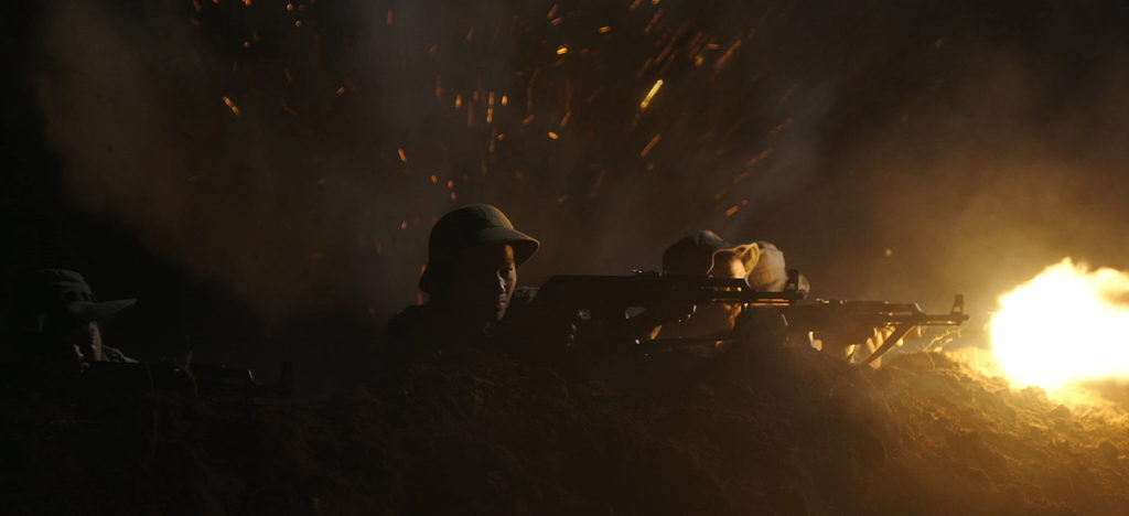
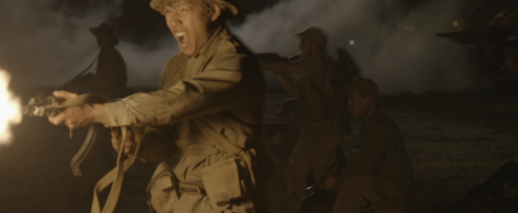
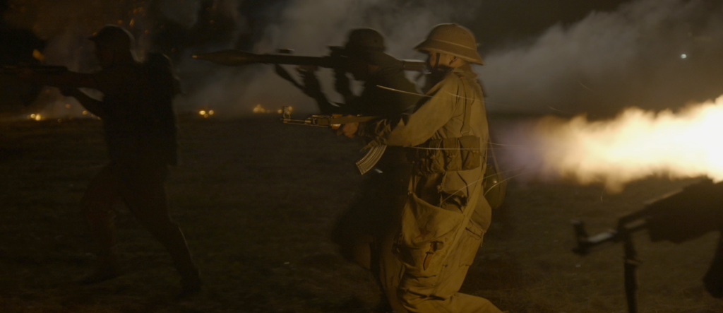
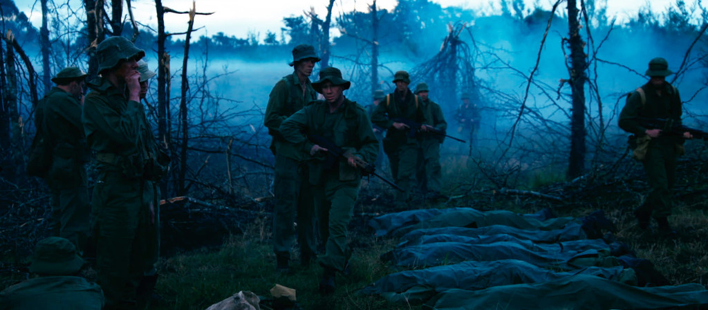
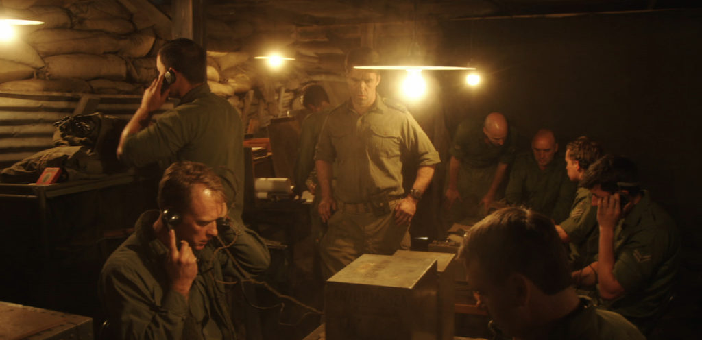
The day ext of the Aussie soldiers after the bombing was shot about 30 minutes after sunset with only ambient light. The scene in the command center using only 100W Tungsten bulbs dimmed to about 50% to get the warmth.
One lighting unit I was able to use was the searchlight mounted on the Centurion tank. These were used in an on/off fashion during the battle when the North Vietnamese soldiers were attacking. The actual light (part of the Centurion Tank) was a 1 million candlepower Xenon that was mounted just above the gun and provided some serious illumination on the battlefield. Of course during battle this light never remained on and was only used in occasional very brief bursts to locate the attacking soldiers causing momentary blindness and making them easy targets for the 50 caliber machine guns.
"The Crater" was screened in Australia on April 25th as part of the Anzac Day, Gallipoli Centenary Celebrations.
Having demo'd the units earlier in the year at a seminar I gave for Band Pro, I knew their potential but did not appreciate the usefulness and versatility of these small units until I had them on set.
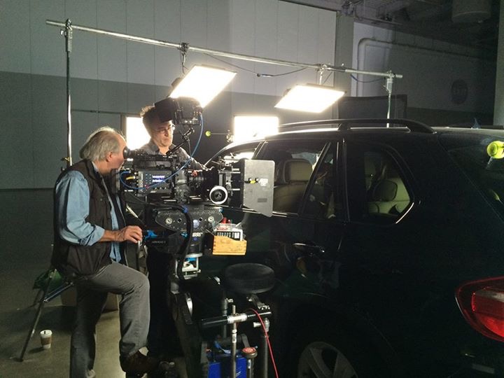
"The Lady Pleaser" The quality of the light is astounding, dubbed by my crew "the lady pleaser", great wrap and essentially the quality of a soft light thru 216 (without the 216). The fall off is relatively short which meant less cutting and shaping in tight locations and being a square emitter they could easily be panned or tilted to control spill and intensity in different parts of the set.
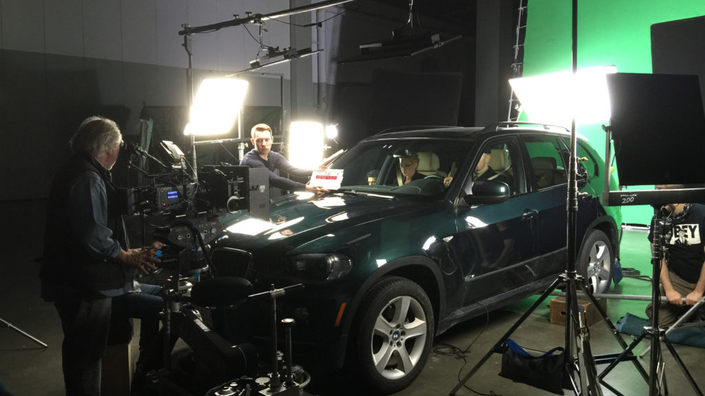
I used them as singles, doubles and quads, to light masters and close-ups, green screen car scenes, men and women. For women, when punched thru diffusion, the light almost becomes a liquid. I also used them skirted as coup lights for large areas where they provided the perfect amount of base shooting on the Alexa at 800ISO, as fill on overcast day exteriors and in ultra low temps (-9 degrees and color temp and output did not change). In every situation these incredible units excelled. I will not be shooting again without them.
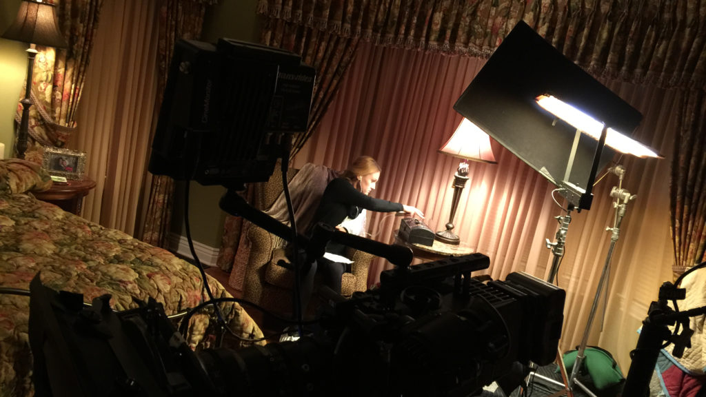
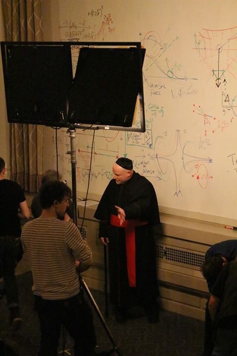
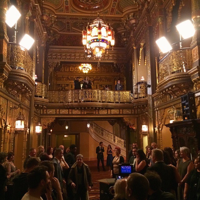
Their small compact size and amazing light quality make them ideal for shooting in very tight locations
Their small compact size and amazing light quality make them ideal for shooting in very tight locations as, at a little less than 1" thick, they take up such a small amount of space. They are also supplied with brackets allowing them to be directly attached to set walls giving them an even smaller footprint. Compared to Kino Flo's or Chimera's, well there simply is no comparison, these little units outperform in every area.
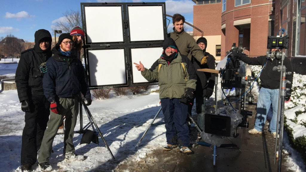
No Heat-No Generator-Less Cost
Of course one of the big advantages of LED lighting in general is that they do not produce heat. Therefor almost all the electrical energy passing into the LED produces light so they are much more efficient. This allowed using the lower wattage lights off normal household circuits, so I was able to structure the lighting for the film around a lighting package that did not force us to carry a generator, other than a 6500W as a backup source or for remote locations. Any night exteriors were shot dusk for night. Actors also loved the "no heat" aspect of the Fill-Lite's . Check them out at www.fill-lite.com